
They’re big concepts and can feel like really big decisions in this overcrowded space we share.
Branding and identity.
Branding & Identity
Who are you?

Cool Fodder
Food, of the earth.
-
This client makes food that is seasonal, grounded in place, using whole ingredients and timeless methods. They wanted to communicate this in a way that wasn’t overt. We moved away from a typical earth style colour palette and theme.
-
Western Australia has over 12,000km of coastline with deep azure waters and its rust red and iron rich soil dominates its landscape. I chose a colour palette reflective of this - bold, dynamic and deeply grounded in place, because ultimately food is of the earth.
-
This branding has colour variations and imagery that complements its base logo. Images of old fashioned service, subtle colour accents and styl
-
We created a dynamic food brand that can be adapted easily for print, digital and social.
We developed a visual language for Cool Fodder that looked as good as their food and allows this brand to show up confidently.
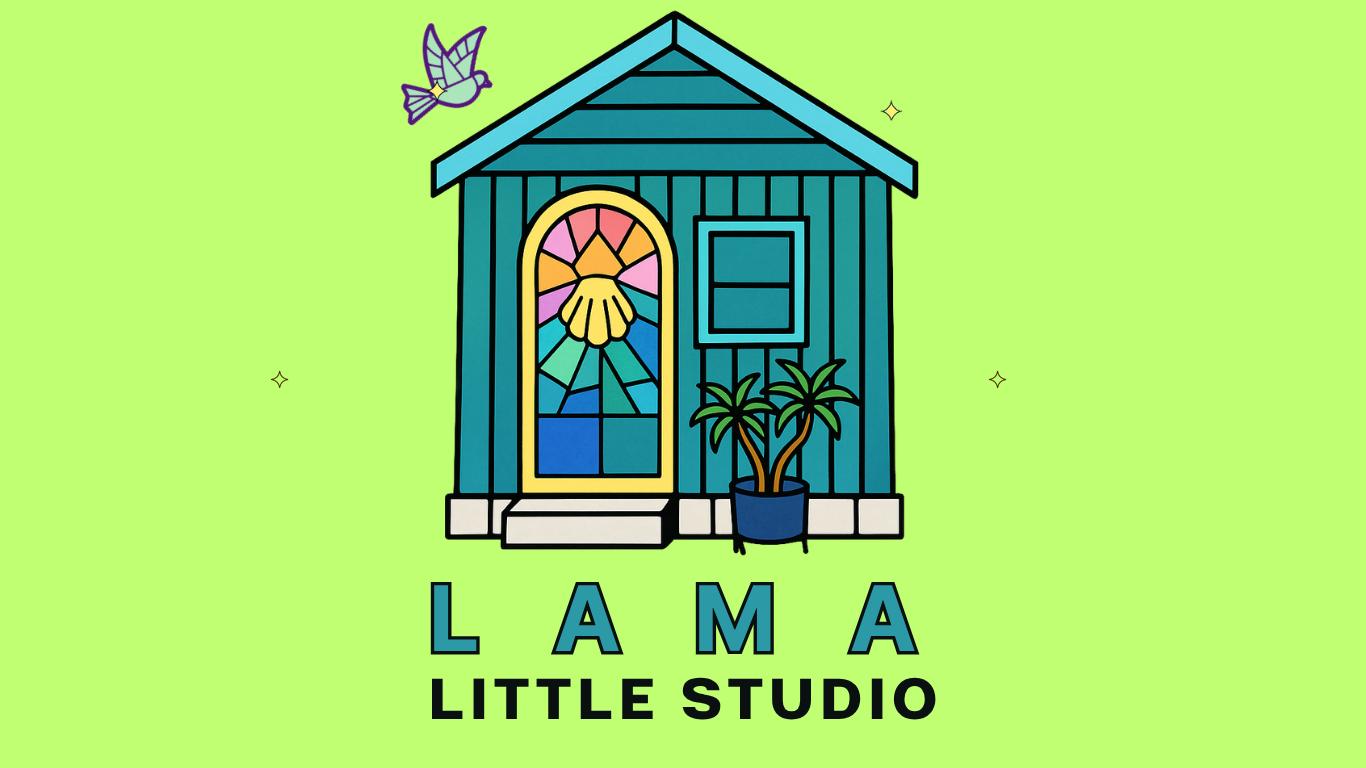
LAMA Little Studio
A glass studio in the great southern
-
I originally worked with this client when she was based in Perth and her home studio was a delightfully restored shed in her backyard. Her render of this space was a beautiful starting point for her brand and logo. But what we felt was missing were the bold colours she works with in her stained glass creations. We reimagined her studio as a bold space, similar to her artworks and inspired by some of her favourite colours.
-
This client works with some spectacular colour and pieces and her branding wasn’t reflecting this properly. By reconfiguring her originally earthy style, we were able to create a design that reflected her work - bright, creative and eye-catching.
-
The background colours can be reshaped depending on the mood, the style, the purpose and the event.
-
The Client was very happy. The design allows her to stand out from the crowd with a simple and meaningful image and accompanying wording.